Content BRD
Whether you’re creating a new microsite or maintaining an existing one, a Word document with all the site content, known as a BRD, proves to be an efficient way to manage sites with Bandolier and clients.
- Word is simple, used by most clients, and has easy-to-use tools to capture and share edits.
- Text styles and tables can mimic the structure and design of a web page. When programmed and used correctly, Bandolier can seamlessly copy and paste text from a BRD into a content management system (CMS).
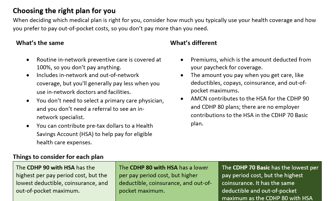
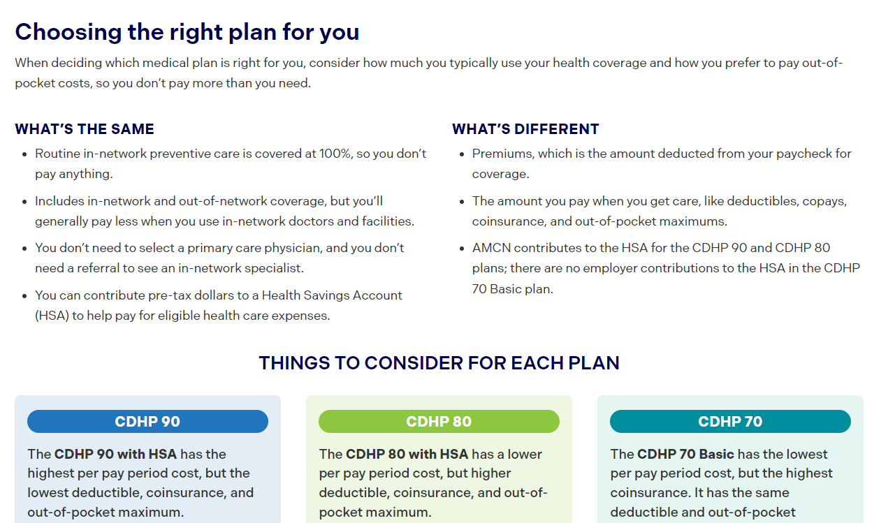
Compare content in a BRD to the same content on a published webpage:
BRD

Webpage

How to capture changes
The content BRD that’s shared with Bandolier should have final, approved mark up only.
Follow these guidelines when capturing changes:
Dos
- Use Track Changes to mark up new content or edits to existing content.
- Use Comments to add notes, instructions, or questions, and to call out very small edits like hyphens and punctuation.
- Keep a record of your changes using Basecamp or a change log at the beginning of the BRD.
Don’ts
- Create a to-do in Basecamp with screenshots and text edits.
- Add in-line comments, use different font colors, or highlight text to document changes.
- Upload a BRD with various edits, questions, and comments from the client — Bandolier should only see clear, final edits.
TIP: Add a comment for small edits
If an edit is very small, like adding or removing hyphens and punctuation, add a Comment to call it out to Bandolier. Even when marked up in Track Changes, these small edits are easy to miss.How to build and use a BRD
Whether building a BRD for an existing site or drafting content for a new site, start with the BRD template .
View BRD examples for current client sites:
Text styles
Use Styles in Word to format text like it’s on a webpage. View the styles gallery under the Home tab in the Ribbon at the top of a Word document.
To apply a style, highlight the relevant text on the page and select the style from the gallery.

These styles are pre-programmed in the BRD template:
| Style | How it should be used |
|---|---|
| Breadcrumb | The navigation path for the page in the site map. |
| Heading 1 | This is the page title. There should only be one Heading 1 per page. |
| Heading 2 | These are section headers used to organize broad topics on a page. |
| Heading 3 | These are sub-section headers used to organize more specific topics within a section. |
| Heading 4 | These are smaller headers used for notes, callouts, and other components throughout a page. |
| Page Intro | This is larger text for an optional page introduction or description. |
| Body text | This is the main text used in paragraphs, lists, tables, etc. |
| Accordion | This is for the label of an accordion, or what a user sees when an accordion is collapsed. Body text is used for the text that appears when an accordion is expanded. Use [+] and [-] to show the start and end of an individual accordion. |
| Hyperlink | This is text that links to another page or site. |
Copy and paste as unformatted text
Text from other sources, like a web page, PowerPoint, or PDF, often has hidden formatting that is time consuming to remove within a CMS.
The easiest way to strip copied text of its formatting is to paste it as Unformatted Text within Word using this keyboard shortcut:
- Windows: Press Control + Alt + V
- Mac: Press Shift + Command + V
View an outline of the BRD
Header styles automatically create an easy-to-navigate outline. Check the Navigation Pane box under the View tab in the Ribbon at the top of the document to open the outline of page titles and section headers.
Layout and components
Use Tables to show the layout of certain content and which components to use.
Add instructions as [red text in brackets] to describe the layout and label components, and to show how content should be targeted (if applicable).
Layout
The layout of a page, or how content is zoned, can be structured a few different ways, such as:
- Full-width page where users scroll through all content vertically.
- Main content across two thirds of the page and a sidebar in the other third.
- A horizontal row with three or four icons paired with text and links.
- A long, bulleted list displayed side-by-side in two columns.
Don’t use floating text boxes – these aren’t compatible with Comments and can mess up the formatting of other content. Use a combination of red instructional text and tables instead.
For example, here’s how a sidebar callout on the right side of a page looks in a BRD:

Components
A webpage is built with a variety of components, like main body text, callout or call-to-action boxes, accordions, sliders, sidebars, buttons, and more.
The BRD template has three pre-built page components in tables:
- Alert banner
- Full-width callout
- Basic content table
- Contacts and resources
Help and support
If you have questions about or need help with a BRD, email or Teams chat Sean McEntee at [email protected].
